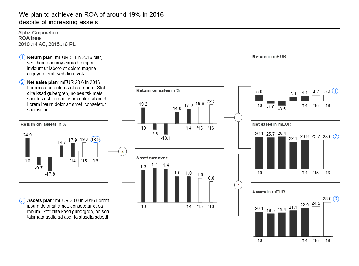
Data visualization guide
Today I've come across a perfect information graphics / data visualization guide:
- Based on the works of Edward Tufte and Stephen Few.
- Comprehensive yet not too wordy (150 pages).
- Highly practical and with lots of examples (197 figures).
The book provides advice on designing clear, concise, and actionable reports and dashboards:
- How to articulate the message.
- How to choose an appropriate chart type.
- How to design specific chart elements.
- How to avoid clutter and increase information density.
- How to make everything clear and consistent.

While the guide itself is great, the authors - IBCS Association - made some questionable choices:
- They vaguely and somewhat misleadingly called it 'International Business Communication Standards'.
- They presented it on the IBCS website in a way that is barely readable (in my opinion).
Fortunately, IBCS published the guide under the permissive CC BY-SA license. So with some hard work and a bunch of Python I've created a web version, EPUB and PDF.
IBCS Association put a lot of thought it the guide, and the result really impressed me. So I encourage you to try it out.
★ Subscribe to keep up with new posts.